Spice up the need to know widget Task
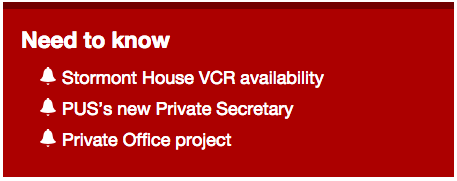
By default, the “Need to know” widget will appear like the rest of the widgets, with a coloured bar at the top, black text and standard links. To make the area stand out more, you can add some custom CSS to the widget.
To enable CSS for a widget area, we use the Zig Widget Class plugin which adds an extra field to widgets for a CSS class. You’ll need to install and activate this plugin before adding your custom CSS.
Read the task on how to customise css styles and paste something like the following into the custom css field. This example uses zign2n as the class name that we’ll use in the widget.
 .zign2n h3 { color: white; }

ul.need li a { color: white; }

ul.need li a:visited { color: white; }

.zign2n { border-top: 7px solid #710000 !important; margin-top: 16px; background: #ac0000;  }
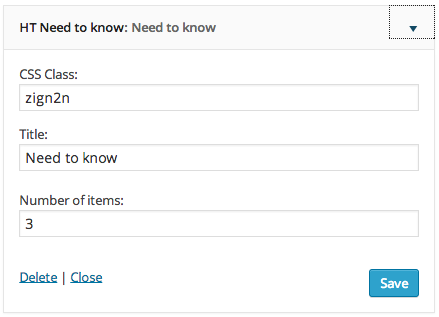
You may need to adjust the px numbers on border-top to match your border height and on margin-top to align the top of the widget area with the rest of the widgets on the page. Once saved, go to your instance of the “Need to know” widget in Appearance, Widgets and add zign2n as the CSS class name: